

Your business website is your digital front of house, the first thing your customers see when they metaphorically walk in the door – so ensuring you are utilising every tool at your disposal to make their experience an easy and positive one is important.
It’s easy to let marketing tasks like improving your website fall to the wayside amongst the many other time-consuming roles involved in being a small business owner. Managing stock, staff and suppliers, plus all of your day-to-day tasks always take the forefront in terms of priorities.
That said, setting aside some time to understand how to make your customers' online experience as seamless as possible will help you earn some quick wins further down the track and ultimately result in more eyeballs on what you're offering, more brand awareness and hopefully, more sales.
We’ve collated five steps small business owners can take to make sure their website is operating in the most effective manner possible, driving traffic and increasing brand visibility.
1. A Good SEO Strategy is Your First Port of Call
You've probably heard of SEO, but haven’t really set aside the time to dive into the details, but SEO is essential for making your website and business searchable. Search engines (like Google) index and rank your website against other similar websites, and then serves a link to your website to search engine users in the order that you have ranked.
If you want customers to be able to Google your name or products and have your website pop up in the first couple of pages, you need to ensure you are using best SEO practice.
Best SEO practice includes incorporating popular keywords in your copy, meta descriptions and titles throughout your website, and increasing your pages 'authority' in the eyes of Google.
Doing an SEO audit of your website content can take as little as an hour. Here are some of the things to check against your current website:
- Is your website mobile-friendly?
This makes it optimised for the user and search engines like Google will favour user-optimised websites in their rankings. - Do your meta descriptions answer your customers' questions and draw them in
Meta descriptions are the 2-4 sentences displayed below the link/title in search engines and should give the user a sense of exactly what they are clicking on and whether the information is going to answer their question. - Does every page on your website have a keyword that indicates what the theme of the page is?
Is this keyword mentioned in the first 100 words of the page? This is how search engines know what the page is about and how to direct users to relevant information. - Do you have any links to external web pages that no longer exist?
If so, you will be penalised for this, so make sure to regularly check over your website for out of date links. - Does your website have a fast loading speed?
People are impatient and are more likely to click off your website and onto one of your competitors if you’re website takes longer than a few seconds to load.
For more in depth instructions on conducting an SEO audit on your website, this guide is very helpful.
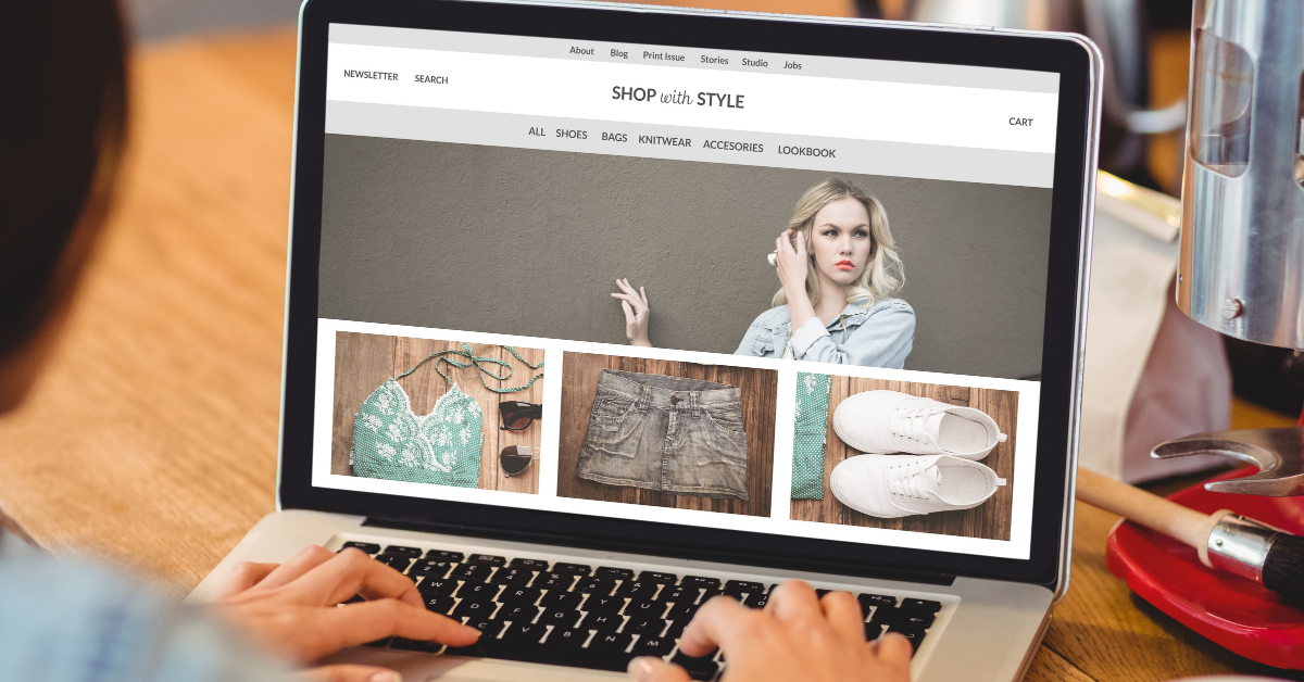
2. Make your Website Aesthetically Inviting
Just as a physical store owner maintains a tidy and professional appearance, website owners should do the same.
It takes users 0.05 seconds to form an opinion about a website. That means you have 0.05 seconds to grab the users attention and convince them to stay on your website.
Design and colours hugely impact this, with 94% of negative feedback about websites being design related. If your design is inviting and welcoming, with complimentary colours and an easy to follow design, then you are much more likely to hold the users attention.
When designing or updating your website, consider your brand colours and fonts and try to incorporate these into the website.
If you don’t know where to begin when it comes to colours and pairing them together for a seamless and recognisable brand story for your online presence, this guide is helpful.
Using high quality, visually appealing and fast-loading imagery with easy to read fonts will help draw in customers and provide them with an enjoyable experience while browsing your website.
A few key tips to consider when it comes to your websites design are:
- Don’t fill your pages with unnecessary text. Use visuals to tell your business’ story rather than using excessive text – especially on your homepage. Create your business one-liner and use that alongside complementary imagery to let users know what your business is all about.
- Make sure users can easily navigate your website. Is the call-to-action button obvious? Can they access it from any page on your website or do they need to go back to the homepage first? Read more on the customer journey in the next section.
- Don’t give users too many options. Make your website design simple and functional. People are easily overwhelmed and are less likely to use your services or buy your product if you are making them think harder than they have to.
- Try to emulate other website designs, don’t do something different just for the sake of it – for example 88% of websites position the main navigation menu horizontally at the top of the page. So if you are trying to stand out from the crowd and do something a bit quirky with your menu placement – visitors to your website are going to be confused rather than impressed.
3. Mapping Your Customer Journey
A customer journey map is a visual representation of the process a customer follows to reach an end goal with your business.
With the help of a customer journey map, you can get a sense of your customers' needs and pain points, and see where you can improve aspects of your website.
Hubspot has some great free customer journey mapping templates.
A few key things to consider when creating your own customer journey map are:
- Do I know who my customer is?
It can be helpful to create customer ‘personas’ and target specific content and services to them. For example, one of your personas may be Sophie – a 35 year old professional who has just brought her first home, she found out about your small homewares business via Facebook. When you know your customers really well, you can curate the customer journey with them in mind. - Are you taking an inbound marketing approach?
Inbound marketing is all about producing helpful, interesting and problem-solving content, solutions or products that your customers actually want to hear about. Ensuring all your website content is taking an inbound marketing approach is one major benefit of creating a customer journey map. - Are you currently able to be proactive about potential issues your customers might be facing on your website?
For example is there a customer service issue that is raised by a new customer that you previously weren’t aware of? When creating your own customer journey map, you are going to pick up on parts of the customers experience that aren’t working well, meaning you are able to proactively fix the issue before receiving complaints about it.
4. Write Copy that Commands Attention
You’ve optimised your website for SEO, you’ve carefully curated the design to be eye-catching and easy to follow, and you’ve mapped out your customers journey – now you need to ensure you are crafting attention grabbing copy to seal the deal.
There are a few simple tips to remember when writing website copy.
- If you are writing a blog post or any longer form content, consider using bullet points. These help to break up big blocks of text and make them more digestible for the reader.
- Use headings and titles in larger sizes or in bold to highlight different sections of the website and make it easier to look at.
- Get to the point! Everyone has had the experience of looking up a recipe and being forced to scroll down four pages of the author explaining that their great uncle was born in Italy and that’s why she has such a strong affinity for tomatoes. It’s a massive turn off and people simply don’t have an attention span long enough to wade through a massive back story to find the information they wanted.
Remember at the end of the day, most customers are looking for a solution to a problem they have. If you can provide a product or service that solves that problem – make that clear.
Be short, be punchy, be straight-forward and be helpful.
5. Make your call-to-action obvious
We’ve all experienced a website with no ‘contact us’ button in sight – and it’s incredibly frustrating, especially when you need to immediately make contact.
Making sure your website has obvious and easy to find call-to-action pages for the following actions that are applicable to your individual business is essential.
- Contact Us
- Get in Touch
- Sign up
- Buy Now
- Download Now
Tying into the design and colour section above, the colour of your call-to-action button is important to consider too. This colour psychology infographic is super interesting, explaining how consumers react to the use of different colours and how colours can impact their spending habits.
Green is the easiest colour for eyes to process and it’s also associated with wealth – so generally speaking, making your call-to-action button green is a safe option.
Your website’s call-to-action button is arguably the most important feature of your website. If users are unable to easily navigate to the call-to-action – whether that’s your contact page or a buy now button – they are likely to leave your site and go elsewhere seeking an easier solution to their needs.
In summation, making things as easy and logical as possible for your customers and website users is the key to optimizing your website.
For more tips around marketing, small business and website designs, check out this blog too.
Make sure that your method of taking payments is as up-to-date as your new website by downloading our Payments 101 Guide, below.


Comments